A lot of business are unwaware of the significance branding colour and the impact it can have on prospective clientele. Studies show that is only takes 90 seconds for someone to form an opinion about your product or business and the colours used in the business design can attribute up to 90% of that decision. Colours send us a message without being overt and can thus determine buying choices. Colour is the first thing that most people see when looking at a company logo, product or office exterior so it is vitally important that you choose the correct colour for you branding, needs and whilst always maintaining a clear understaning of your target audience.
At SPF our knowledge of colour psychology is a key aspect we reflect upon when creating colour palettes for our company branding designs, all with the focus on increasing your customer attraction and engagement—different colours can impact the way buyers perceive a business. Here is a quick look at how we implement the use of colour in our work;
Types of colour:
To simplify what is quite boring we can say that there are essentially 2 types of colours, warm and cold. As you would expect warm colours consist of red, orange, and yellows which can invoke a sense of warmth or passion in design which can be great for a frienly inviting/family business. Warm colours however are vibrant and energetic so are best used sparingly as accent colours to stop your design or product looking overpowering or visually irritating. Cool colours include blues, purples and greens. These colors naturally create a calming effect, and are often popular in interior/ professional office designs as they encourage relaxation but much like warm colours they should be used in moderation to avoid becoming depressing.
Colour and Gender:
In 2003, Joe Hallock researched colour and shared his insights in his paper Colour Assignment. Although there will always be anomalies the paper highlights some clear preferences in specific colours across gender. Among the most noticeable is that both genders like blue and green.
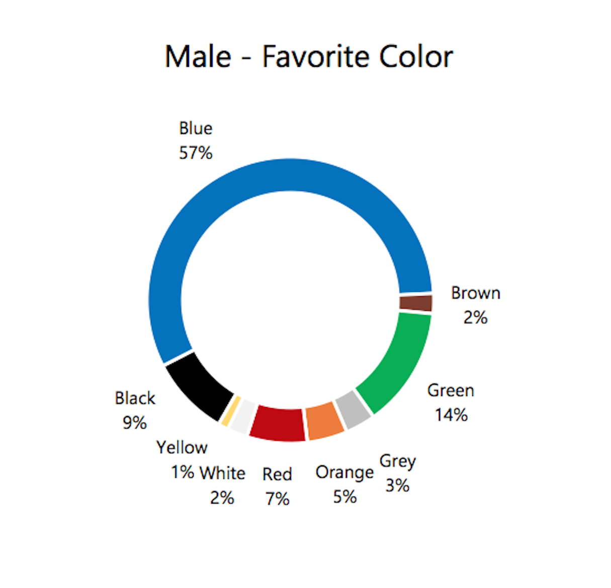
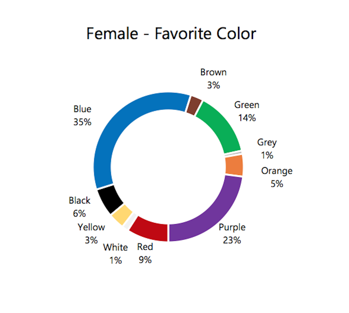
Image credit: Joe Hallock.
Similarly, men and women both shared least favorite colors: brown and orange.
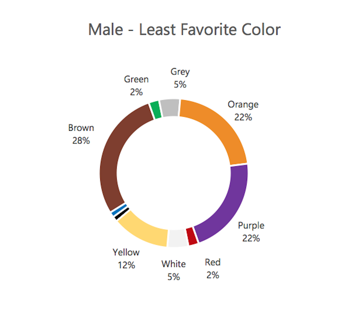
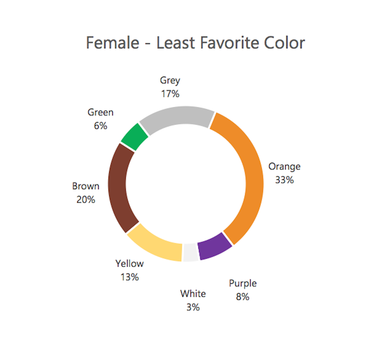
Image credit: Joe Hallock.
However interestingly the second favorite colour among women is purple which is shown to be one of the least favorite color among men so this is vitally important when it comes to choosing the correct colours for your customer demographic. Another valuable insight is when it comes to shades, tints, and hues, men generally prefer bold colors, while women prefer softer colors.
In Culture & Industry
Colours are a powerful tool for creating emotions, alot of articles on colour tell you what each colour means and signifies for example, in many Western cultures, white is associated with positive things, while in many parts of Asia, white is associated with mourning. As a result, it’s is very tricky to narrow down a single meaning for each colour, it is therefore important to have a clear idea of who your target audience is and what colours are often associated with in that respectve cultur. The same is true for Industry branding. Sub conciously we form colour associations for specific industries, such as white for tech, green for eco products, and red for fast food. This is a learned association and by applying the knowledge to you brand or product you can actually encourage people into making a purchase etc.
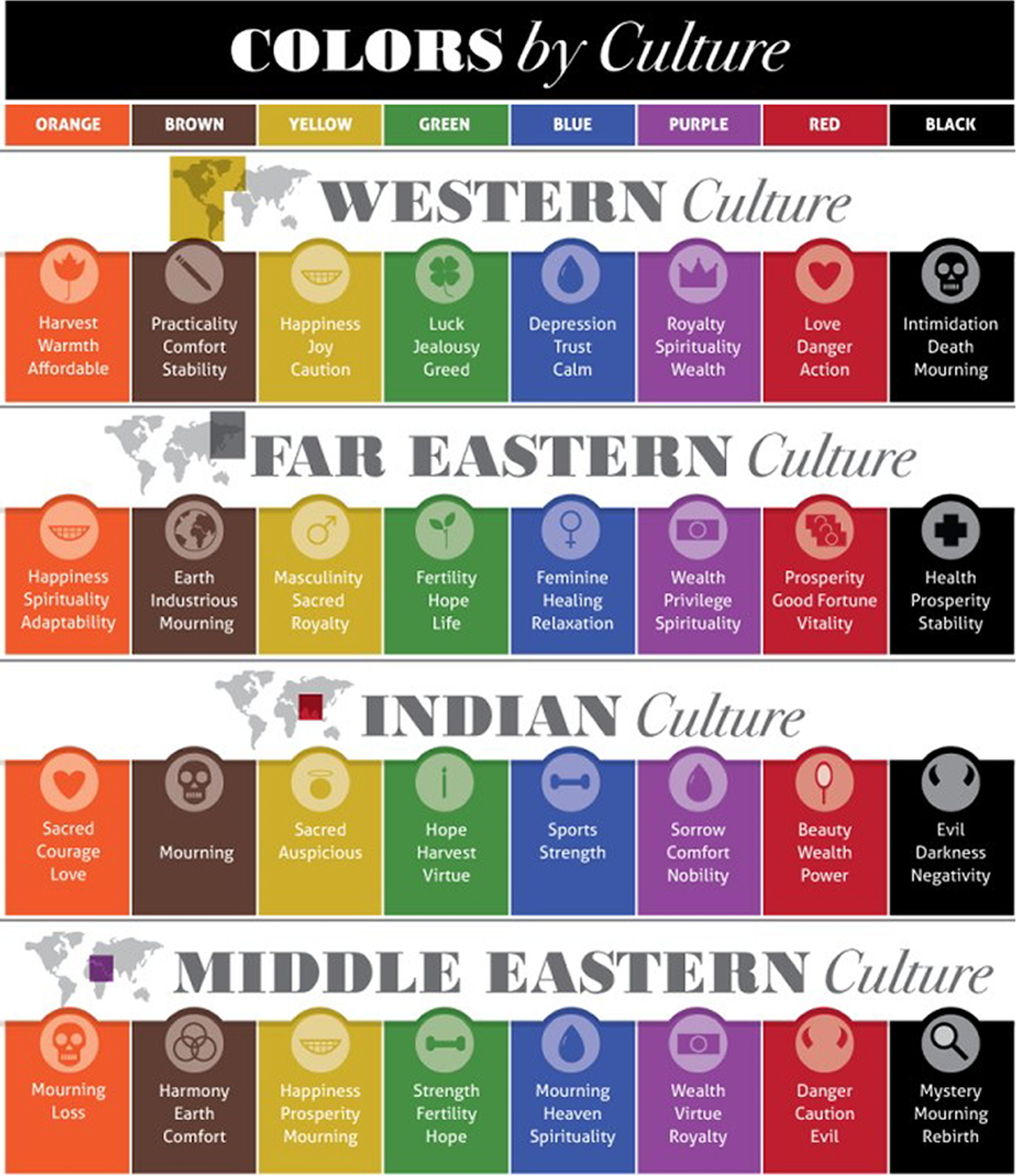
Image credit: Colours and Materials.
But this by no means a rigid box with no room for movement. In fact, while many companies choose to match customer expectations by using their industry’s standard colours, it can be equally successfull to go against your competitors in order to stand out. A great way to decide which way you wanto to go is to get some customer feedback. Ask them what colours they associate with the brand, that will give you a better understanding of what your users expect to see and, most importantly, why.
If you would like help with your company branding, don't hesitate to get in touch.